Spatial, Not Exclusive: A Practical Guide to Accessible 360° Video
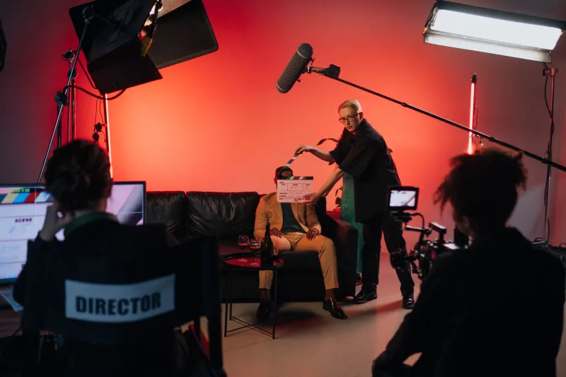
There’s a moment in almost every 360° project where someone in the room says “we’ll do accessibility in post” — and everyone nods, because the stitch is drifting and the client wants a version by Friday. Then post arrives, and the captions sit at the bottom of a sphere nobody is looking at, the audio description fights the ambience, and half the test audience has to lie down.
Spatial media has a habit of breaking the accessibility conventions we spent two decades getting right on flat screens. That’s not a reason to shrug. It’s a reason to plan.
Comfort is an accessibility feature, and it comes first
Before captions, before description, deal with the fact that a significant chunk of any audience will feel rough watching camera movement they didn’t ask for.
A few things that cost almost nothing:
- Lock the horizon. A drifting horizon is one of the quickest routes to nausea. If your rig wobbles, stabilise it and crop in.
- Slow everything down. Walking pace is faster than it feels in a headset. Halve your intended speed and check again.
- Offer a guided mode. A gentle auto-drift through key views, with free-look as an option rather than an obligation.
- Ship a flat cut. A 2D version of the piece, framed deliberately, is not an admission of failure. It’s a second door into the same room.
- Explain the space at the start. Ten seconds telling someone what’s behind them and how the piece will move is worth more than any settings menu.
If you’re building your own player, expose field-of-view reduction and horizon lock as visible toggles. If you’re on a platform that doesn’t, say so in your own copy rather than pretending the experience is comfortable for everyone.
Captions that live in the scene, not on top of it
Head-locked captions — the kind glued to the viewer’s eyeline — are the default because they’re easy. They’re also the least comfortable option during movement, and they obscure a chunk of the frame you spent money on.
Three workable approaches, in rough order of effort:
- World-anchored panels. Place the caption text in the scene itself, at a sensible reading distance, angled toward a plausible viewing position. It feels native and it survives head movement. The catch is that it only works if you know where people will look — so give them a reason to look there.
- Player-level overlay. Fixed to the display rather than the sphere, so it never distorts. Less immersive, more reliable. Often the right call for documentary work.
- Head-locked with guardrails. Fine for static scenes, keep it short, keep it high-contrast, keep it away from the centre of interest.
Whichever you pick: two lines maximum, short line lengths, a solid backing plate rather than drop shadow, and no text over busy textures. And if you’re using a British Sign Language presenter, decide early whether they’re a person in the room or an inset panel — and don’t let a 180° crop chop their hands off.
Audio description in the round
Spatialising audio description is seductive: the describer sits to your left, roughly where the thing they’re describing lives. It’s also a trap. If the viewer turns away, the description vanishes from their attention span.
The pragmatic answer is a hybrid. Anchor the describer to a consistent forward position so listeners always know where to find them, then use gentle spatial cues when the description genuinely needs a direction. Duck the ambience under speech, leave real headroom in the mix, and provide a separate AD track with a clear toggle rather than one baked master.
Don’t forget orientation description. In a 360° scene, “what’s around me” is content, not scene-setting. A short opening pass that names the space and its occupants does more work than any amount of mid-scene narration.
Testing without a development budget
The good news: you don’t need a lab. You need people, time, and a willingness to be told your piece is uncomfortable.
UK organisations that regularly work with production teams include RNIB and its technology networks, RNID, Sense, Thomas Pocklington Trust, and a long list of regional sight-loss charities. Disabled-led theatre and arts companies — Graeae, Extant and others — are often the sharpest critics of spatial work because they’ve been watching people get it wrong for years. Local universities with accessibility or HCI groups will often trade a session for a credit.
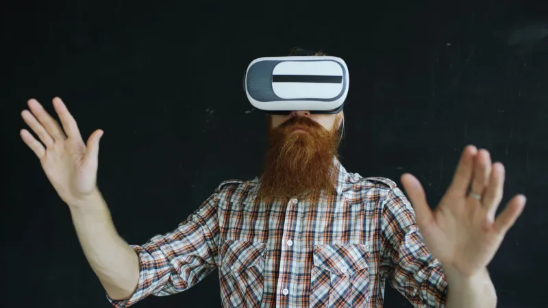
A realistic protocol for a small team: five to eight participants per access group, paid at a proper rate, with travel covered. Test on the devices people actually own — phones in hand, cheap cardboard viewers — not just the headset your studio bought. Ask about comfort and comprehension, never about whether they liked it. Run the session twice: once before the final grade, once after.
And when you can’t meet in person, ship a headset or send a link with a structured questionnaire. It’s imperfect. It’s still better than guessing.
Know what your platform can’t do
Most consumer 360° players handle captions badly. Text pinned to the bottom of the frame bends at the poles. Spatial audio description is patchily supported at best. Some platforms will silently drop your alternate audio track. Check the release notes before you promise a client a feature, and budget for a custom web player — A-Frame or Three.js — if the access requirements are non-negotiable.
None of this is glamorous. But accessibility in spatial media isn’t a compliance task bolted onto the end of a pipeline — it’s a set of creative constraints that tend to make the work clearer, calmer and better paced. The teams treating it that way are already making the more watchable stuff. The rest of us should catch up.